


Reading on Trains Number 32: Lisbon Aesthetics

There’s an old-fashioned-ness about Lisbon that I like. I see it in the cobbled squares, shaded by plane trees and inhabited by numerous sparrows, the pretty shops selling traditional requisites: pens, lace, wool, cigars – and there are many slightly gloomy pharmacies with wooden cabinets and a white-coated pharmacist wearing half-moon glasses on a cord. The names of the shops are sometimes written in mosaic on the adjacent bit of pavement, which I take as a guarantee that they’re not going to become a Starbucks tomorrow.
You see people playing cards or listening to transistor radios. There’s a lot of wood, brass, marble. My early evening routine was the have a glass of wine in the wood panelled lobby of the Deco Sao Jorge Cinema on Avenida da Liberdade. I’d drink it sitting on a high wooden stool at a high table as I watched the academic-looking filmgoers arrive. Somebody on-line complained about the price of the drinks in this cinema. My glasses of wine (quite casually poured, but always amounting to at least 200ml) were three Euros, or about £2.50, and it seemed to me that the prices in Lisbon are old-fashioned, too.
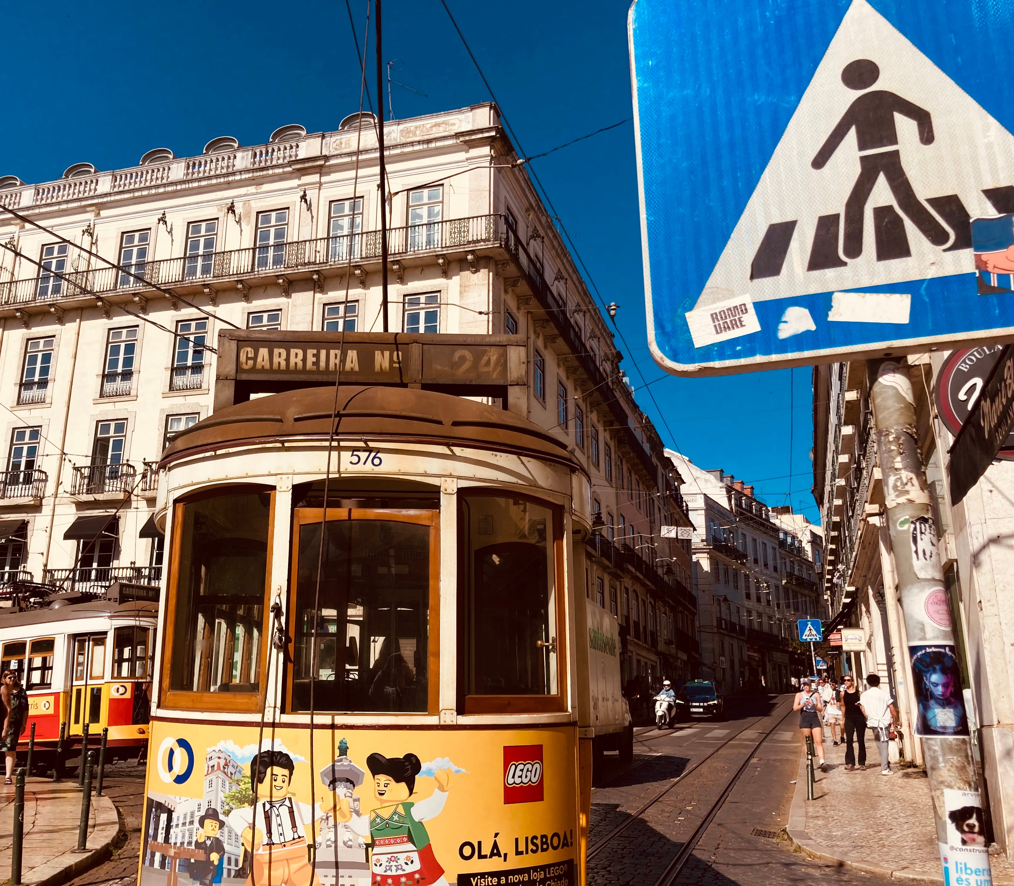
A high proportion of men in Lisbon sport moustaches. The women tended to wear flowing linen dresses, often cycling in them, without wearing helmets. My wife, a former fashion editor, thought the Lisbon women even chicer than the Parisian ones. The Lisbon colours are generally beautiful (the sunlight helps of course). The older buildings are in pastel shades, and the shops selling canned fish are actually celebrations of colour rather than canned fish. The taxis are a suave black and turquoise. The four lines of the Lisbon Metro are signified by their colours: green (Verde), red (Vermelha), yellow (Amerelo), blue (Azul). The logo is highly elegant: most of a letter ‘M’, white on red. The stations are spacious and cool after the sun, the electric light glittery in the semi-gloom.
The network opened in 1959, and the train interiors resemble a trendy kitchen of about that time: wood veneer, seats of oak and red plastic. The stations are rangy and simply arranged. Most have beautiful, glazed tiling (better, even, that that of the Yerkes Tubes in London), the earliest examples – modest-seeming abstracts in subtle colours – are by Maria Keil, wife of the architect of the Metro, Francisco Keil do Amaral, and if this was nepotism (in either direction) I’m not complaining.
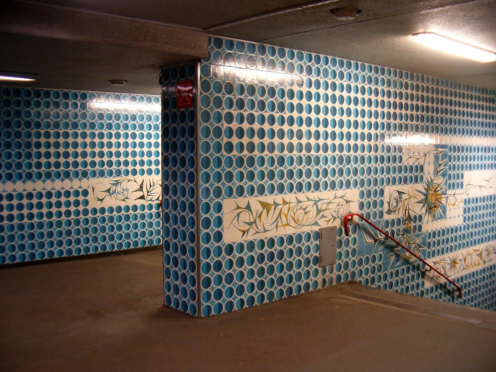
More figurative designs came in later, but essentially the Lisbon Metro is also an art gallery you don’t have to walk through. And the lines have a habit of suddenly breaking out into the open on viaducts (Lisbon being so hilly), as for instance between Chelas and Bela Vista on the red line, when you’re suddenly traversing a great valley or brownish, sunburnt grass. But of course, the main attractions are the trams, as cheerfully yellow as pasteis de nata.
Keep reading with a 7-day free trial
Subscribe to Reading on Trains to keep reading this post and get 7 days of free access to the full post archives.